In 2019 Seagate set out to celebrate their 40th anniversary by creating a visual identity to be used internally and in select external marketing channels.
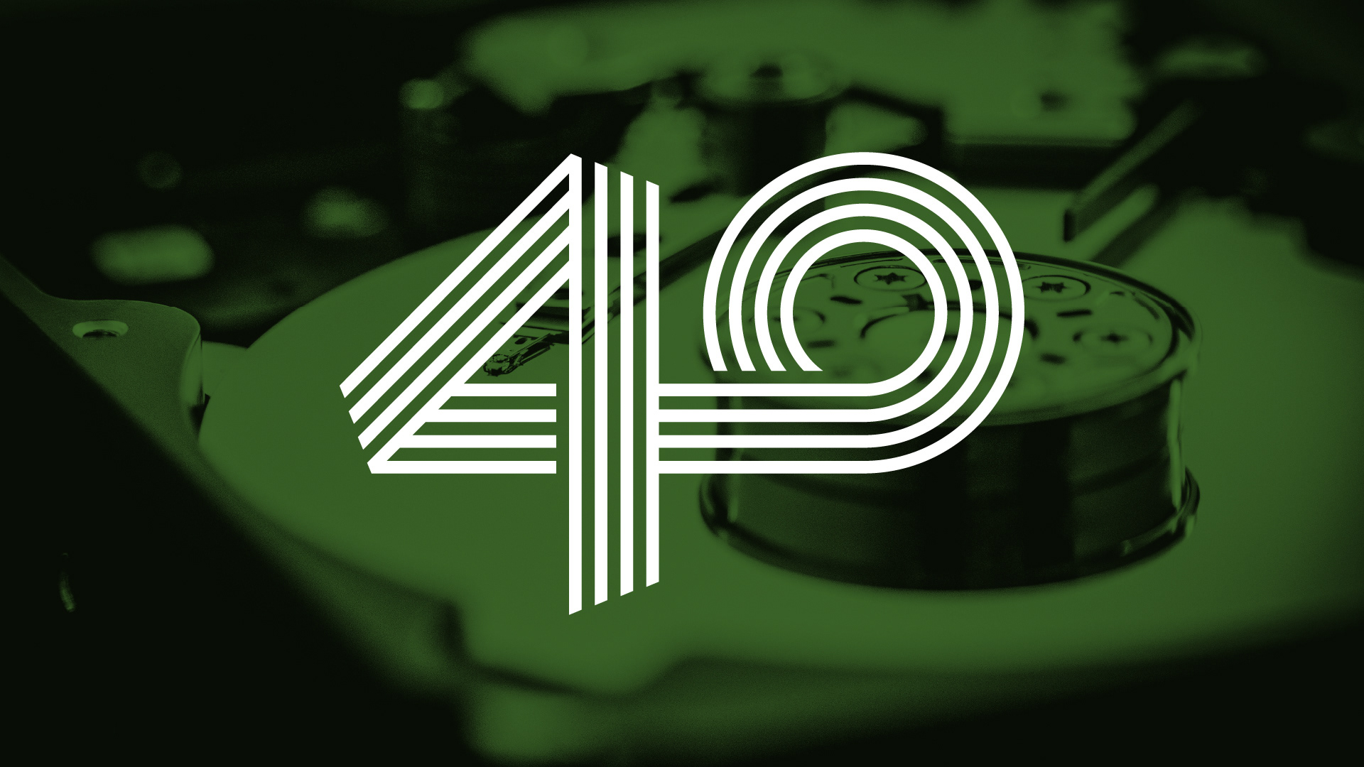
The anniversary logo hints at the the shape of the internal components of a modern hard drive and the motion of classic tape driven storage, The four stripes also represent the four decades and the worlds leading data storage company.
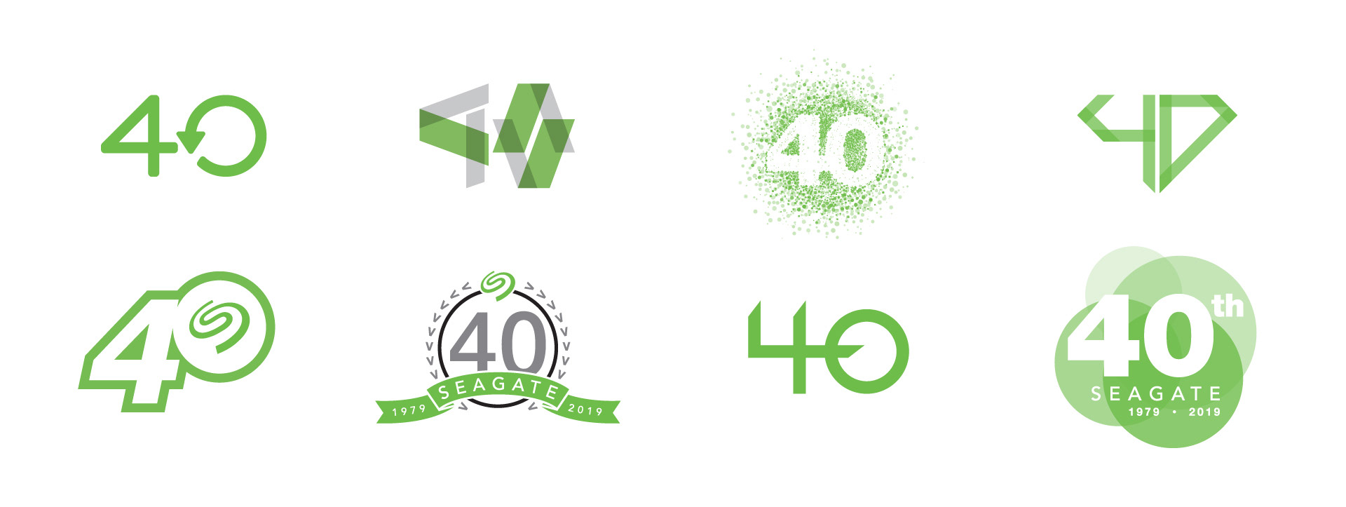
Part of the exploration phase. Many of these concepts are based visually off of other Seagate initiatives, and key product and corporate branding.
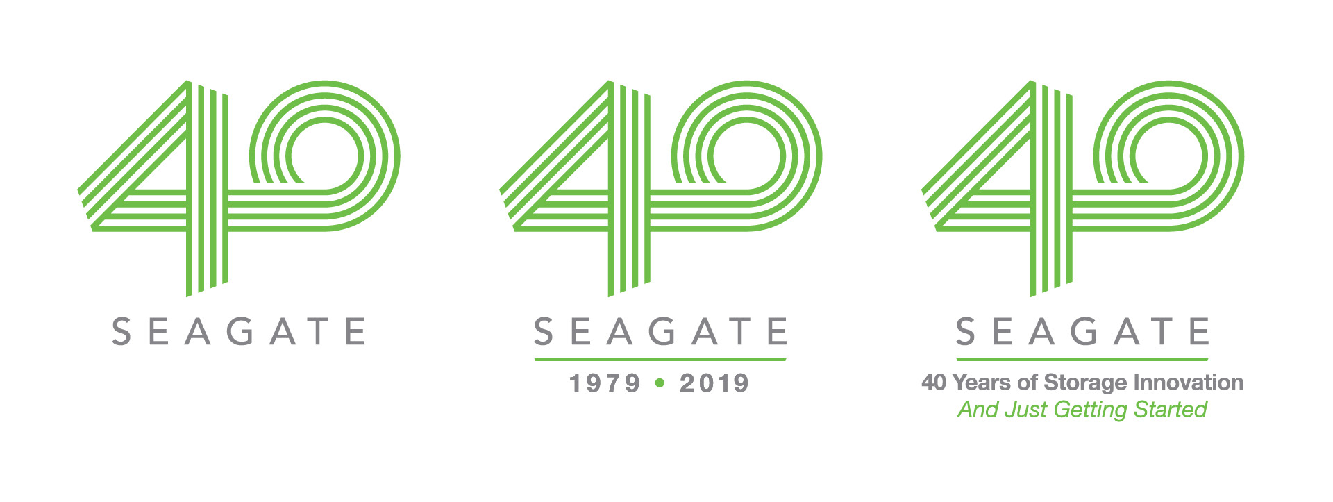
Three versions of the logo were created with text added to the icon for various marketing purposes
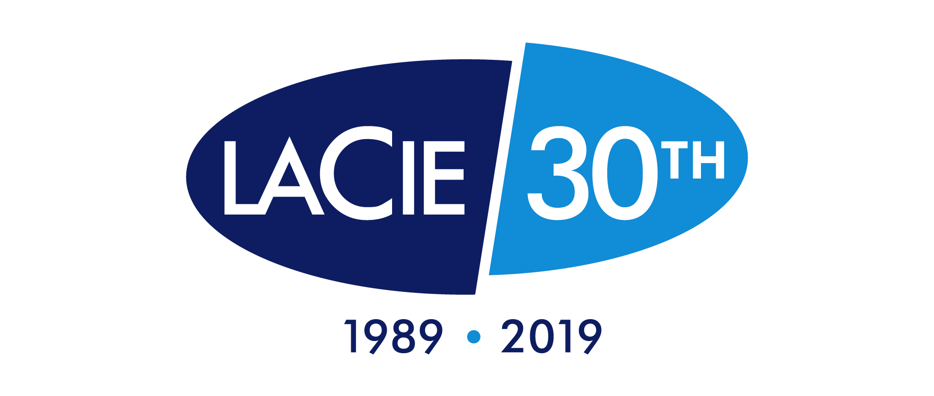
Coincidentally, Seagate's industry leading creative pro brand LaCie was also celebrating a big anniversary that same year. This logo was based on the long standing LaCie oval.